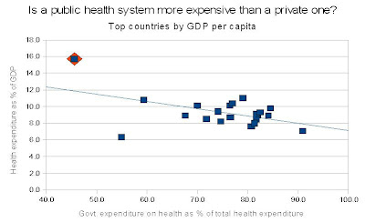
I made this graph in order to try to answer the question: Is a public health system more expensive than a private one? The x-axis is government expenditure on health as a percentage of total health expenditure. The y-axis is total health expenditure, as a percentage of GDP.

The orange diamond represents the United States. Data is from 2007 and compiled from the
World Health Organization 2010 report. The solid blue line is a linear fit.
The countries shown are from the top 27 countries by
GDP per capita. Not shown are those countries which spend less than 4% GDP on health: Singapore, and the Islamic/Arabic monarchies Qatar, Brunei, United Arab Emirates, and Kuwait. Also not shown are countries which receive external resources for health: Israel.
List of countries shown: Luxembourg, Norway, United States, Switzerland, Netherlands, Australia, Austria, Canada, Ireland, Sweden, Iceland, Denmark, Belgium, Germany, United Kingdom, Finland, France, Japan, Republic of Korea, Spain, Italy.
Thoughts?
